We Will Rise Again
Creative Direction | Video Production | UI/UX Design
We Will Rise Again was a series that showcased Singaporeans’ unbending resolve — a call to rise to the occasion — a choice and a resolution following the circuit breaker measures were implemented.
Set in our garden city, a nation with a history of overcoming insurmountable odds. The unswaying commitment found in our cleaners who continue to keep our city clean in spite of the risks, the compassion of renowned chefs coming together to feed workers isolated and far from home, our flight stewardesses answering the call of a nation and embodying the true spirit of the Singapore Girl.
Together with the creative team, we began shortlisting stories individuals going out of their way during the circuit breaker to help others.
This project began with a successful grant application with the Singapore Tourism Board. What followed was the development of the overall series narrative, brand identity, video production and UI/UX design for the campaign website.
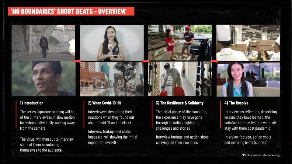
Excerpts from the grant proposal (left) and style frames/shoot beats (right) respectively.
Creating A Compelling Narrative
The objective of the We Will Rise Again series was to show how everyday individuals, no matter who they were, played their part in doing something impactful for the community around them. The episodes were divided into 4 categories: No Boundaries, With A Smile, Iron Chefs, and Business as usual. Each of the these told of the character’s specific struggles and how they rose above them.
During pre-production, my team and I put together a roster of suitable characters to feature on the episode, write/craft unique interview questions based on their stories and conduct pre-interviews over Zoom to allow the individuals to become familiar the questions and also to further develop the video narratives based on their answers.
My responsibility during the video shoots was to ensure the talking points during the interview were in keeping with the overall message of the series, as well as to guide the editors on the direction of each of the four episodes.
Bringing An Identity To The Series
Due to the project having a video series, I developed a basic look and feel for the proposal which evolved into the applied identity for our visual communication across digital platforms. The red and white colours were to depict the colours of the Singapore flag, while the red coincidentally represents “universal brotherhood and equality of man”. The overall high contrast black and white look was in reflection of the difficult times the world is going through, but it also helped with grabbing attention in the adapted designs.
A Central Platform Viewers
To help views explore the stories in a curated manner, the creative team decided to host all videos, information and credits for viewers to find on a consolidated website. The concept for my design was to bring users through a organised playlist of the 4 episodes, as well as the little character features in between. Not only would users know what videos we had already published during the campaign, but could know about anticipate the future episodes yet to be released. The navigation on the left of the page intentionally resembles a timeline to let users know the flow of the video release schedule.


